SAConnects magazine has won 13 Evangelical Press Association (EPA) awards for the 2021 publishing year. EPA is a professional organization of Christian print and digital publications and the world’s largest professional organization for the evangelical periodical publishing industry. Each award is based on excellence in its category.
SAConnects has won 34 EPA awards since the magazine began seven years ago. It ranks among the top five denominational magazines in the U.S., which includes a field of 31 magazines.
Award of Merit — Denominational Publication
Editorial Staff: Warren L. Maye, Robert Mitchell, Hugo Bravo, Reginald Raines, Lea L. Greene, Lu Lu Rivera
“Thought-provoking content, seamless design, and photography that speaks a thousand words begin with deep and spirit-filled conversations. I’m privileged to be among a team of professionals who consistently generate those interchanges that result in the fruition of great ideas in print.” — Warren L. Maye, editor in chief
Judging Criteria: A print publication serving as the official voice of a denomination.
Judge’s comment: “Every aspect of this magazine is well developed and well designed for the Salvation Army audience.”
To read all our issues, go to saconnects.org/portfolio-items/saconnects-magazine.
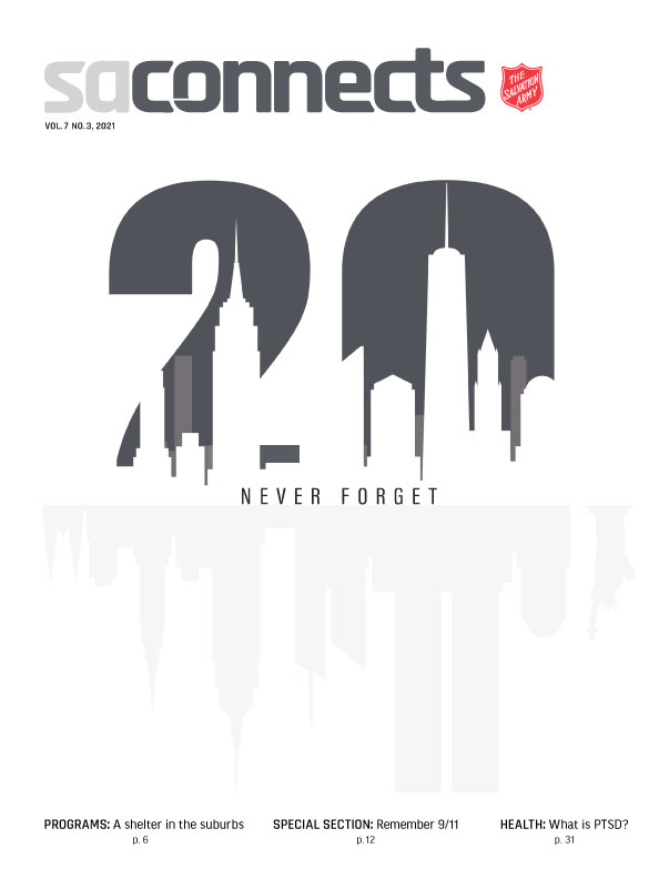
First Place Winner — Cover
Author: Reginald Raines
“Never Forget” is the mantra of 9/11 survivors and the title of this cover, which offers a memorable array of design elements that dazzle the eyes and boggle the mind. By using subtle and striking reversals of positive and negative space, black and white imagery, and matt vs. varnished stock, a fitting tribute represents that unforgettable day.” – Warren L. Maye, editor in chief
Judging Criteria: Skill of execution | Creativity | Aesthetic appeal | Typography (including logo) | Communicative power
Judge’s comment: “Excellent publication. It was my pleasure to judge this work.”
To read this issue visit, issuu.com/saconnects/docs/sac07_03
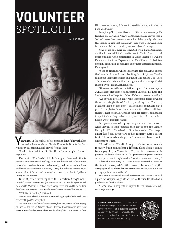
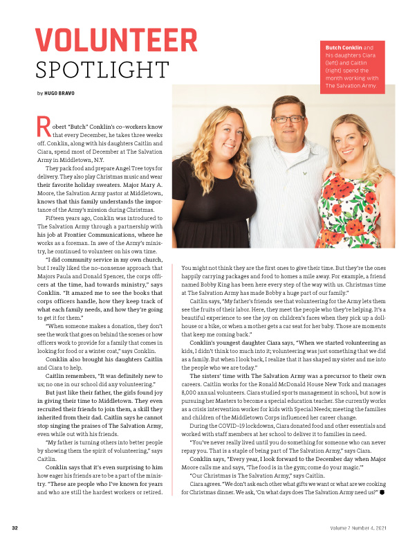
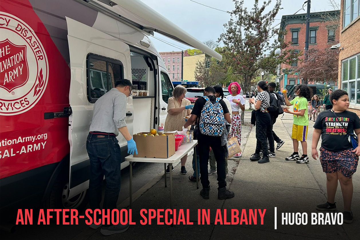
First Place Winner — Department – Volunteer Spotlight
Author: Hugo Bravo
Volunteers have been a part of The Salvation Army since its beginnings. This monthly article shares the stories of volunteers from across the Eastern Territory. They each have different stories and reasons for why they give their own time to serve, but all of them believe in the mission of The Salvation Army. – Hugo Bravo
Judging Criteria: Unique writing style/voice | Strength of writing | Appeal to intended audience | Originality of treatment/approach | Takeaway value for reader
Judge’s comment: “Solid stories of ordinary people whose lives have been changed and are now making a difference for others. Effective use of specific details and key quotes. These pages don’t tell readers what to do, but trust a well-told, powerful story to connect and inspire readers.”
To read this article visit, issuu.com/saconnects/docs/sac07_03/34
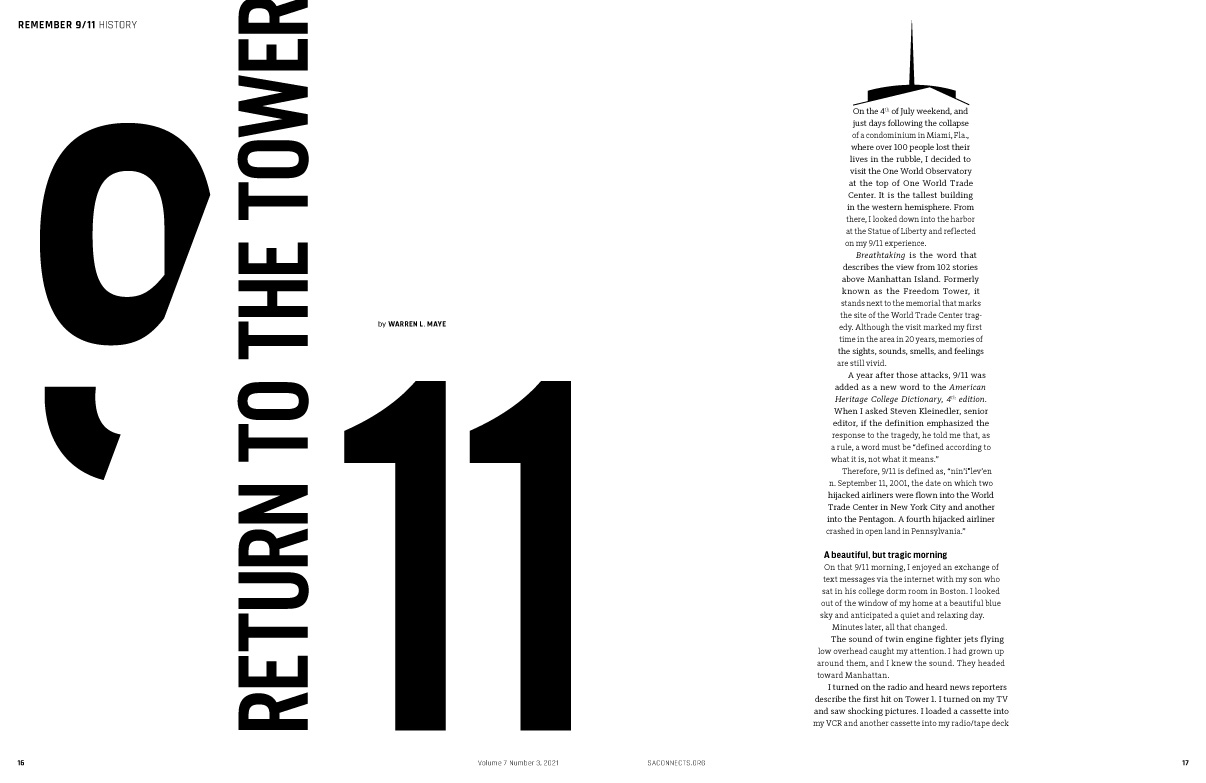
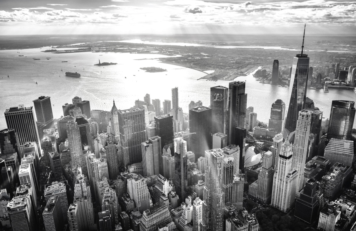
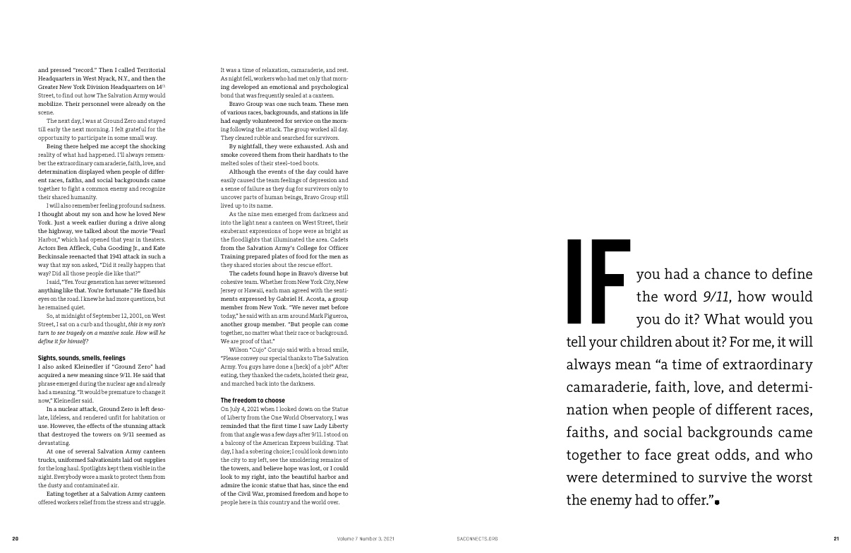
Fourth Place Winner — Feature Article – 9/11 Return to the Tower
Author: Warren L. Maye, Lea La Notte Greene, Reginald Raines
“Words are inadequate to describe the sights, sounds, smells, and emotions of 9/11. A mere magazine article is too short a piece to express the narrative this event truly deserves.” —Warren L. Maye, editor in chief
Judging Criteria: The entire multi-page presentation of a single feature article, including editorial content, related sidebars, title, use of imagery, overall design.
Organization and design | Writing | Use of imagery (photos, graphics, illustrations) | Thoroughness of coverage | Title
Judge’s comment: “The writer’s stye was engaging and thoughtful. I enjoyed it. I loved the tie-in between the two 9/11 events. The design was creative and the piece well organized.”
To read the article visit, issuu.com/saconnects/docs/sac07_03/18.
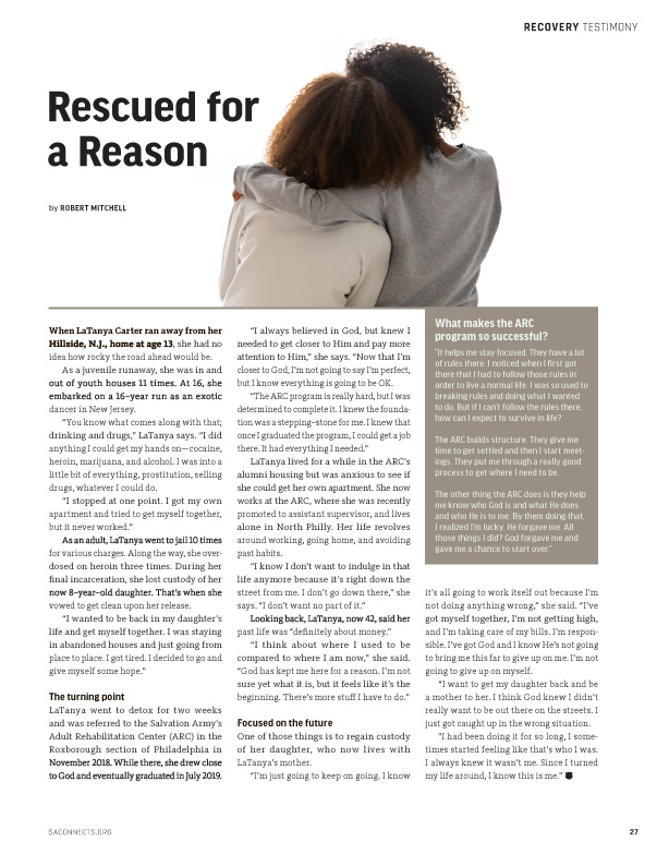
Second Place Winner — General Article: Short – Rescued for a Reason
Author: Robert Mitchell
“A mother, a daughter, and an addiction; and a way out through a relationship with God and The Salvation Army. This story is at the essence of our message to the world.” – Warren L. Maye, editor in chief
Judging Criteria: Any original nonfiction article with a word count of 900 or less.
Idea (timeliness, appeal) | Sincerity and believability | Unique writing style/voice | Takeaway value for reader | Dramatic quality
Judge’s comment: A good report on what could be “just be another ministry story.” Compelling story. Covered well. Good writing.
To read this article visit, issuu.com/saconnects/docs/sac07_02/29


Fifth Place Winner — First–Person Article – 9/11 Return to the Tower
Author: Warren L. Maye
Judging Criteria: Autobiographical account.
Idea (timeliness, appeal) | Sincerity and believability | Unique writing style/voice | Takeaway value for reader | Dramatic quality
Judge’s comment: “Great idea! Very believable.”
To read the article visit, issuu.com/saconnects/docs/sac07_03/18.
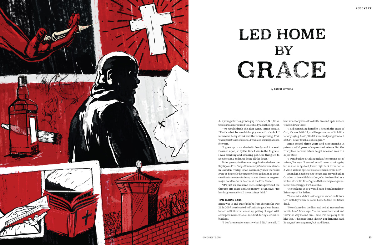
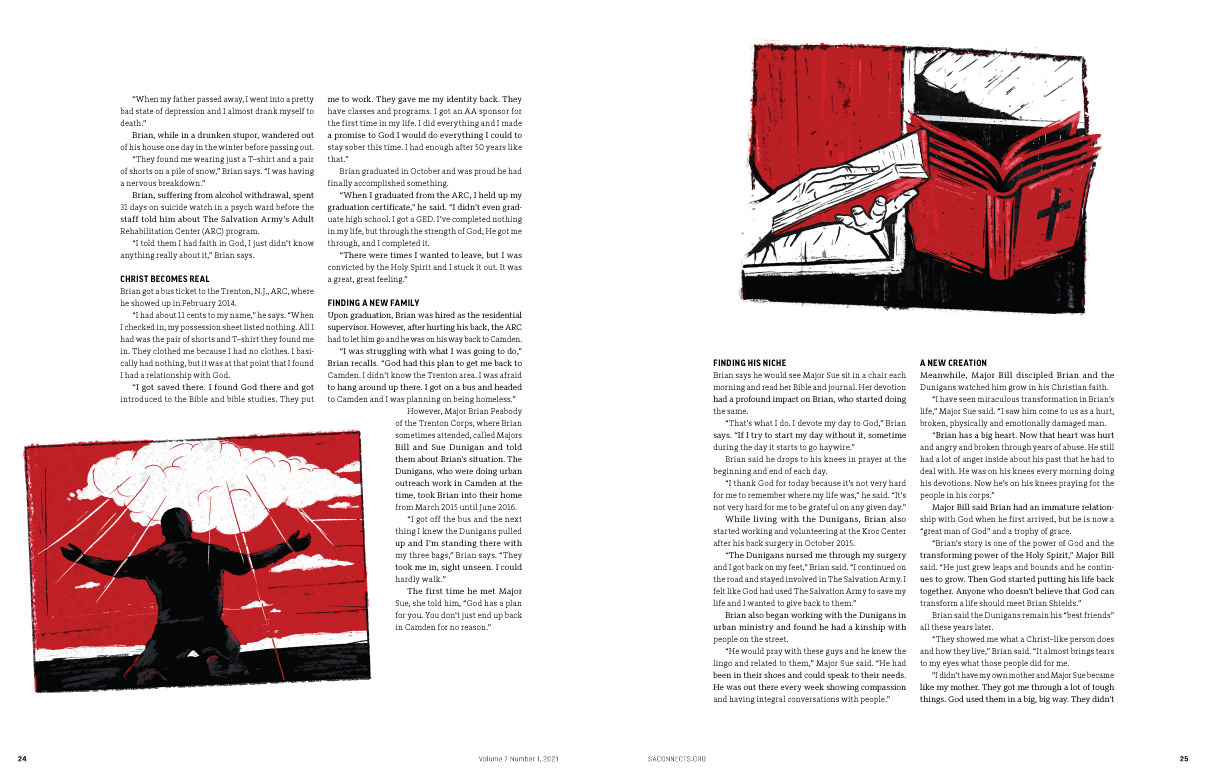
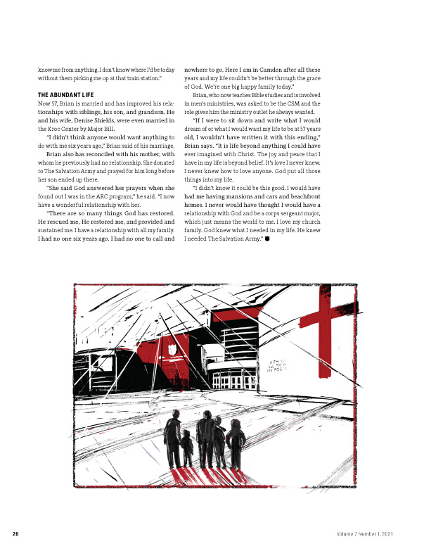
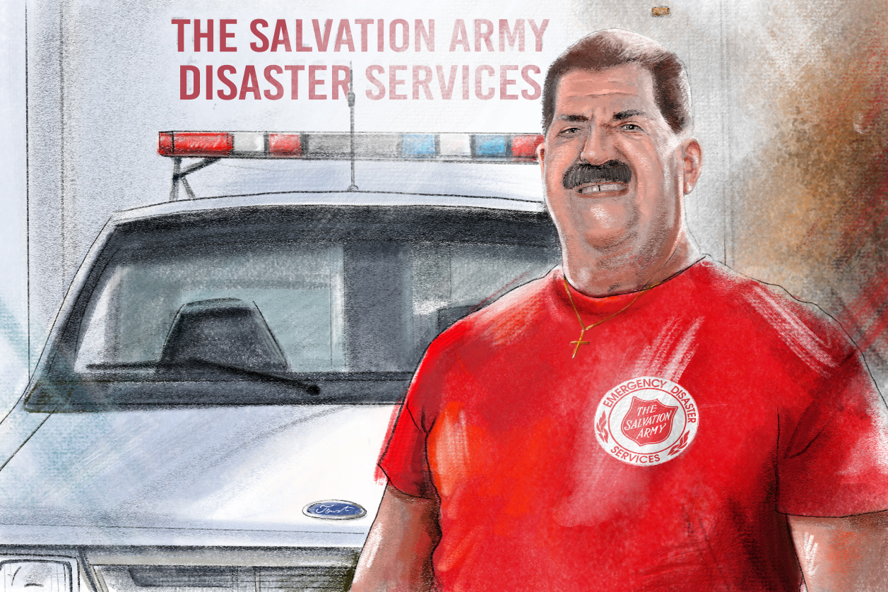
Fourth Place Winner — Original Art: Traditional – Led Home by Grace
Author: Reginald Raines, Joe Marino
Judging Criteria: Original non-photographic illustration. (May be a cartoon illustrating an article. May include use of type.)
Composition | Technique | Appropriateness to context | Clarity of communication | Impact for reader
Judge’s comment: The graphic-novel style of illustration is put to good use with this article. The spare red, black and white color palette is effective in illustrating the harsh tragedy depicted in the article.
Second Place Winner — Publication Design
Author: Reginald Raines, Lea La Notte Greene, Keri Johnson, Joe Marino, Mabel Zorzano, Dave Hulteen
“Congratulations, design team. Thank you for the empathetic and careful way you participate in conversations, read articles in the quiet of your office, and interpret those words into effective images and layouts.” – Warren L. Maye, editor in chief
Judging Criteria: The graphic presentation of editorial content of the publication. Submit two consecutive issues by mail.
Graphic vitality | Graphic execution | Continuity and pacing | Distinctiveness | Appropriateness for content
Judge’s comment: This is a knock-out redesign with so many amazing spreads that are truly unique and bold. The dynamic white space combined with strong typography make it a winner. And kudos to the writers for giving the designers lots of room to create, and thus compelling the reader to dive into the content. Excellent work!
First Place Winner — Publication Redesign
Author: Reginald Raines, Lea La Notte Greene, Keri Johnson, Joe Marino, Mabel Zorzano, Dave Hulteen
Judging Criteria: For significant design change.
Improved graphic vitality | Improved execution | Improved continuity/pacing | Improved distinctiveness | Improved fit with content
Judge’s comment: A successful redesign should display a bold leap forward and your publication has made this leap. There is greater simplicity and nice use of white space, strong photography, and cool illustrations-plus a great new logo. Great job!

First Place Winner — Two–Page Spread Design — 9/11 Return to the Tower
Author: Lea La Notte Greene
“This is by far my favorite type of graphic design. Subtle yet bold, typographic design. Many years ago, in college I fell in love with typography and letter form. Being presented with this award really means a lot to me. I am very proud of this work. – Lea L. Greene, Publication Content Manager and Designer
Judging Criteria: Graphic presentation that includes blend of typography, text, photo, and/or illustration.
Use of space | Creativity/aesthetic appeal | Use of art and photography | Design and typography | Appropriateness for context
Judge’s comment: This is superb design, boldly using typography and white space to express an iconic story in a new way. And there are so many towers on this spread using all different sizes of typography. I appreciate that even though this spread looks sparse with lots of white space, there is actually a lot of content as well, seven paragraphs. Excellent execution and overall exquisite design.
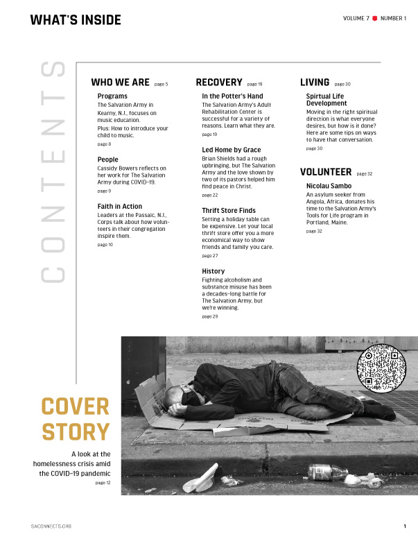
Fourth Place Winner — Table of Contents
Author: Reginald Raines, Lea La Notte Greene, Warren L. Maye, Robert Mitchell, Hugo Bravo
Judging Criteria: Overall concept and design that includes blend of typography, text, photo, and/or illustration.
Organization and layout | Creativity and style | Skill of execution | Aesthetic appeal | Typography
Judge’s comment: The direction of this TOC is exactly right. Good for you. It just needs to take the next step and develop a little.

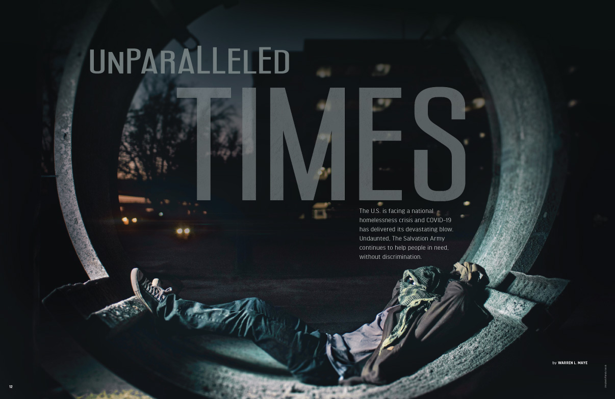

Fourth Place Winner — Titles — Unparalleled Times, 9/11 Return to the Tower, Turning the Beat Around
Author: Warren L. Maye, Robert Mitchell, Reginald Raines, Lea La Notte Greene
“Discussion, reflection, and implementation leads to great collaboration. Such was the case with the design and formation of these exciting titles.” – Warren L. Maye, editor in chief
Judging Criteria: Submit entire layout for each article.
Creativity | Relevance to the story | Audience appeal | Typography & Design
Judges comment: Powerful designs that perfectly illustrate the stories. Great job!


First Place Winner — Typography and Lettering — 9/11 Return to the Tower
Author: Warren L. Maye, Lea La Notte Greene
“Discussion, reflection, and implementation leads to great collaboration. Such was the case with the design and formation of these exciting titles.” – Warren L. Maye, editor in chief
Judging Criteria: Can be a single page, a spread or an entire article.
Creativity | Skill and execution | Appropriateness to context | Impact and communicative power | Use of color (including black)
Judge’s comment: You should be proud of this work. It takes a fair amount of restraint by a series of people to arrive at something this subtle. Congrats for that.
Congratulations. In the end, the concept here, along with the integration with editorial, make it the winner. While I think there are spots where the graphic design could improve, the use of typesetting as an integral part of the story is best in class.

